• About
  • Contact

House of Turquoise

and teal, robins egg blue, aqua, sky blue, seafoam green, and ocean blue

  • HOME
  • ROOMS
    • Living Room
    • Kitchen
    • Dining Room
    • Bathroom
    • Bedroom
      • Nursery
      • Kids Room
      • Teen Room
    • Office
    • Outdoors
      • Porches
  • Paint Colors
  • Get the Look
  • Shop

Fantasea Campe – Seaside, Florida

August 31, 2015


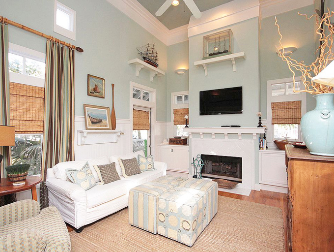
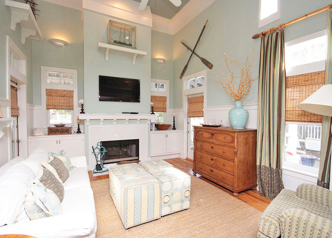
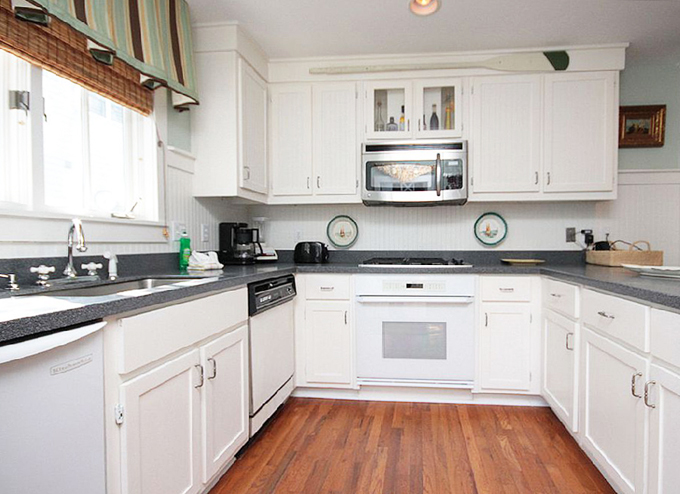
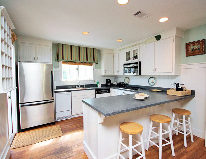
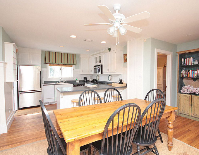
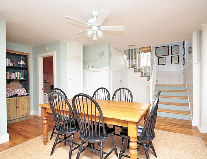
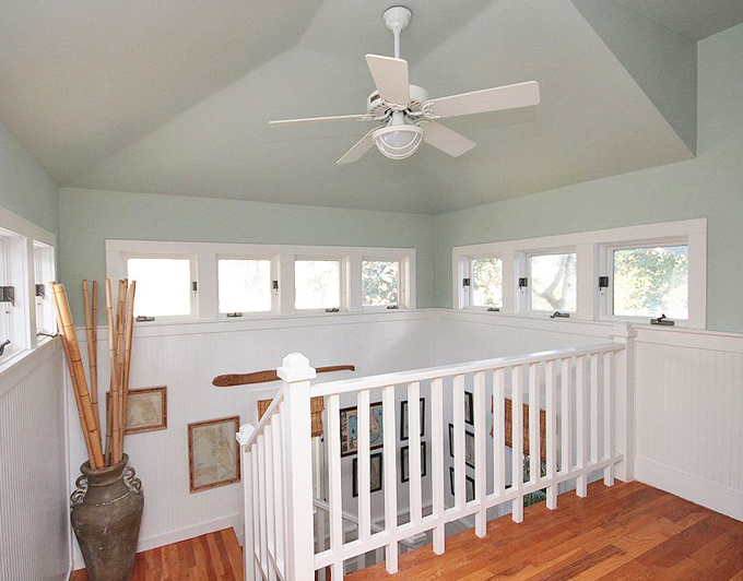
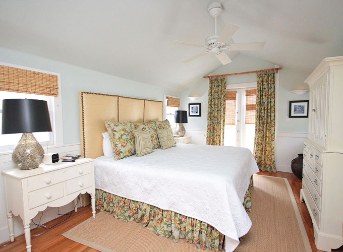
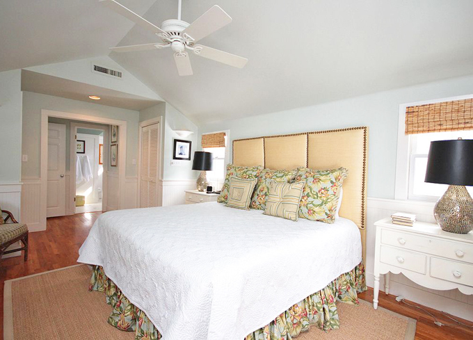
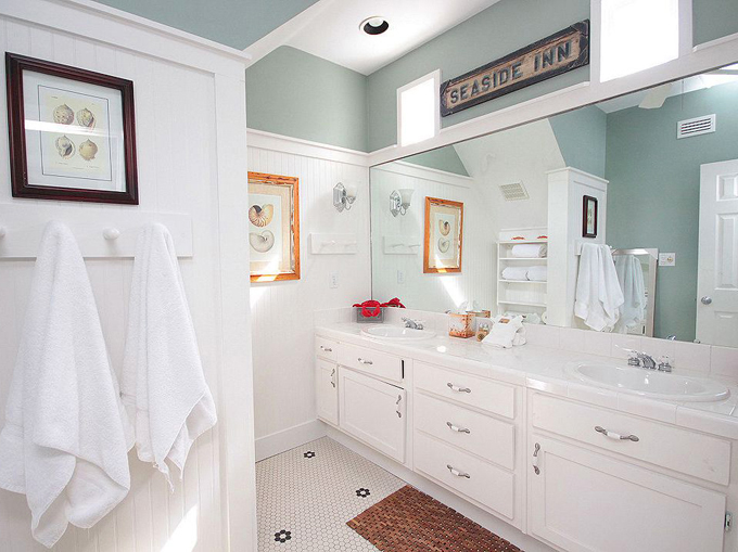
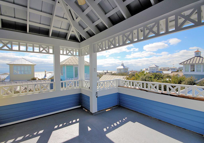
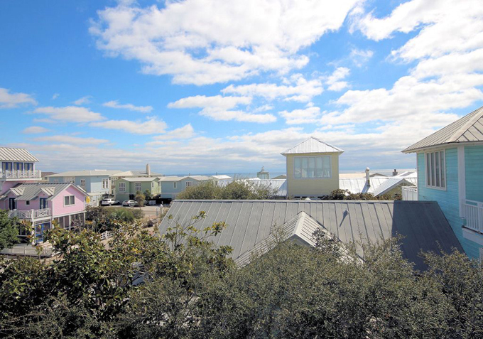
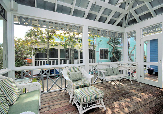
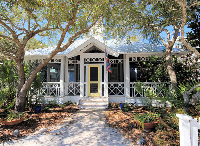
I wish I could be back in Seaside! Fantasea Campe is a beautifully decorated cottage just a few houses down from the beach in the idyllic Florida community. The serene beachy hues and nautical touches give a nod to the coastal setting, but would look just as lovely in any landlocked locale! I wish I knew the paint colors that were used, but I’m getting a strong Sherwin-Williams ‘Sea Salt’ vibe! Love how they even painted the stair risers! The entire home feels so comfortable and relaxing, but the upstairs master retreat is particularly inviting. And oh how I’d love to hang out in that tower! What a great view of the colorful town and the gulf in the distance! See more photos and get rental info here!

For a look at more of the fantastic homes of Seaside, see my post here! Can’t believe it’s almost been two years since we were there!

Get the Look:

Love turquoise? Visit my shopping blog Everything Turquoise…updated several times throughout the day! Check out Decor by Color for even more color-themed shopping!

Related Posts

  • Melanie Turner InteriorsMelanie Turner Interiors
  • Ronald F. DiMauro ArchitectsRonald F. DiMauro Architects
  • Kim Grant DesignKim Grant Design
  • Historical Concepts | Tammy ConnorHistorical Concepts | Tammy Connor
  • Mary Mac and CompanyMary Mac and Company
  • KP Designs and AssociatesKP Designs and Associates

Share this:

  • Click to share on Facebook (Opens in new window) Facebook
  • Click to share on X (Opens in new window) X

See More | 30A, Bathroom, Bedroom, Coastal, Dining Room, Get the Look, Kitchen, Living Room, Porches, Stairways, Uncategorized

« Collins Interiors
Natalie Clayman Interior Design »

Comments

  1. ChanaGoanna says

    August 31, 2015 at 7:28 pm

    The wall color of the room in the first two photos is very similar to my LR/DR color, which is Farrow & Ball's Pale Powder. Beautiful, subtle, watery color that always looks fresh but doesn't leap off the wall and yell at you. It's perfect with cream, white, gray and gold.

  2. Jil Sonia McDonald says

    August 31, 2015 at 10:31 pm

    Absolutely stunning – so light and fresh!

  3. Carol says

    September 1, 2015 at 7:59 pm

    Erin, I also love anything turquoise although I lean toward the lighter shades like aqua. Thanks for all the inspiration and ideas.

  4. Anil Exports says

    September 4, 2015 at 10:17 am

    Wow, this is probably one of the coolest tutorials I’ve seen. Need to get into this ASAP!

    marble exporters in india

I’m Erin and I am obsessed with the color turquoise. I started this blog to collect inspirational photos I find of fabulous rooms that feature all of the lovely shades of my favorite color. For even more turquoise, visit my shopping blog Everything Turquoise!

Copyright © 2025 · House of Turquoise

Copyright © 2025 · Pink Theme on Genesis Framework · WordPress · Log in