Hey there! I’m Kelly Rogers, of Interiors for Families and Kelly Rogers Interiors. As a longtime reader of House of Turquoise, I am tickled pink (or, should I say, a mid-tone blue-green) to be filling in for Erin today while she is enjoying some well-deserved sunshine down in Florida.
Do you know anyone who has delayed decorating their home because they have small children, and are worried the little ones will just destroy all of their beautiful things? Maybe this even describes you? And when is it actually “safe” to make an investment in your home – when the kids are 10? 15? Off to college?? That’s an awfully long time to live in a home you don’t absolutely love. Well, my sister-in-law was one of these people a few years ago, and her dilemma became my inspiration to become a decorator (and to start my blog as a resource for similarly puzzled parents!).
Today I’ll show you around her family’s beautiful home, which just so happens to feature our favorite hue (of course!). Together we created spaces that not only reflect their taste, they are also durable enough to stand up to their three small children – currently aged 5, 3 and 1. It’s grown-up style made kid-friendly (my passion!).
Come on in!
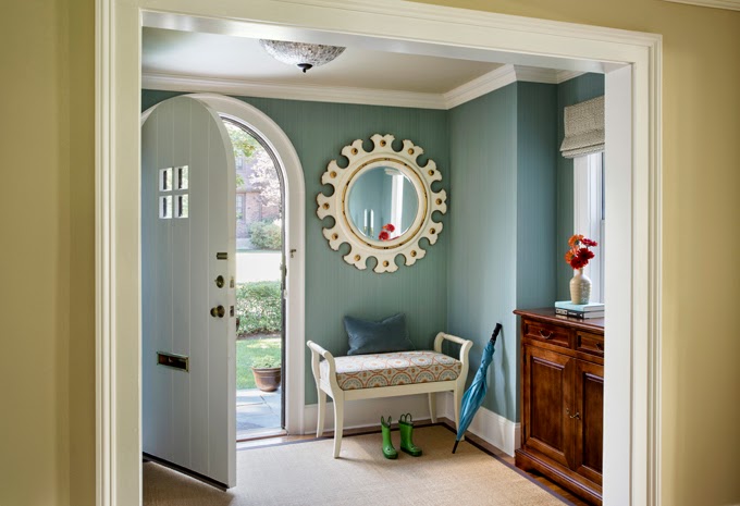
The foyer of this house, which is a lovely old Tudor, has a great, original feature, which is the massive arched door that greets you upon entry. It was getting a little lost among the “50 shades of cream” here, and throughout the first floor living spaces. We used a wonderful strie wallpaper from Farrow & Ball to accentuate the lines of the door – and of course to incorporate some much-needed color, which also helps to define this as its own space with its own function. This is the “formal” entrance where guests are welcomed, and not the mudroom where kids are running in and out all day long. It’s also appointed with a bench (shhh…Home Decorators with a re-covered cushion!), a show-stopping mirror, and a narrow console with a surprising amount of storage, tucked into a very shallow niche. The creamy walls of the adjacent living room are reprised here on the ceiling.
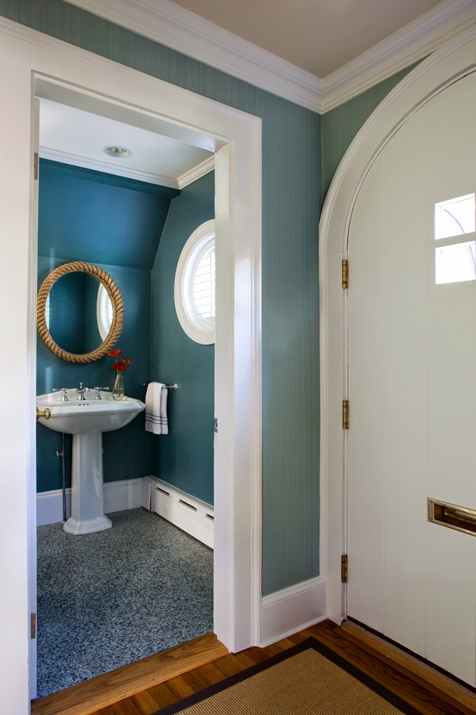
The powder room off the foyer received a quickie makeover with two simple updates: paint and a new mirror. The bold color, Benjamin Moore’s Fair Isle Blue, helped to put the existing busy granite floor tile in its place, and connected it beautifully with the blues found in the foyer and living spaces. We used their Aura Bath & Spa paint, which is zero VOC and mildew resistant.
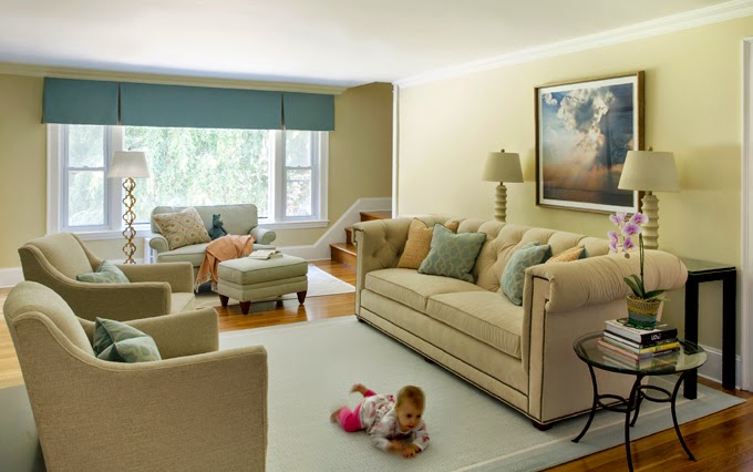
This is what you see when you walk through the front door – a large front-to-back living room with a lovely view out to the backyard through an epic picture window. There is no separate family room or den in this home, and this space is also “Grand Central” when it comes to traffic – you have to walk right through it to get anywhere. The imperatives for this space were many – something polished enough for entertaining grown-up guests, comfortable enough for TV watching, and open enough to accommodate playing (or army-crawling!) children and people walking through 24/7.
Before I go any further, can I just address the elephant in the room? You’re thinking, here she is going on and on about family-friendly design, and she does off-white upholstery?? YES! You, too, can use light fabric on your furniture – as long as it is the right type of performance fabric. Here, I used Ultrasuede on the CR Laine chesterfield-style sofa. The manufacturer even gives you directions on how to remove ball point pen (spoiler alert: use rubbing alcohol)! And it is super easy to keep clean and looking fresh, feels luxuriously soft, and is durable as all get-out. The other fabrics here, and the custom Stark area rug, have been treated with a non-toxic, eco-friendly stain shield.
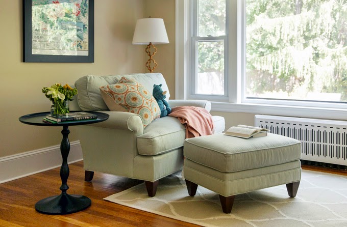
To better take advantage of that view outdoors, and to claim a previously underutilized space, we set up a reading area with a chair-and-a-half and ottoman, also from CR Laine. It’s the perfect place to snuggle up with the kiddos and enjoy some special stories. By the way, I do realize that I am probably the only decorator in history to ever style a living room photo shoot with a stuffed animal seated on a chair. That’s just how I roll ☺.
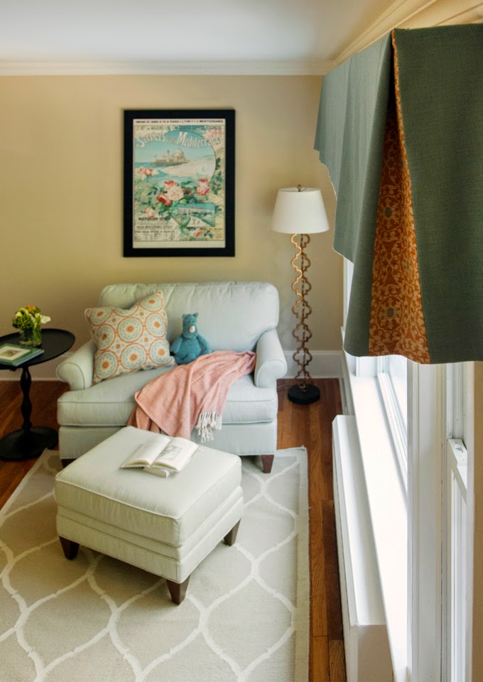
Here’s a little “peekaboo” box-pleat detail on the new valance! It’s like a friendly greeting every time you come down the stairs.
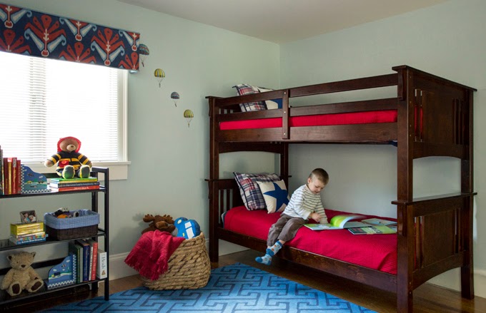
With the arrival of baby #3 came an opportunity for the two big brothers to share a bedroom. We didn’t have a huge budget for this room, so we used existing pieces, like the folding bookshelves, where possible, and found great deals on bedding from Pottery Barn Kids, and a great graphic flat weave rug from Land of Nod. Even the paint color stayed (as did, by popular demand, the paratrooper decals ☺). One splurge was the custom upholstered cornices in a favorite John Robshaw ikat print from Duralee, which provide a purely decorative top treatment that is layered on top of the existing, functional blinds. By the way, using a classic color scheme like red, white and blue is not only timeless, but it can make it easier to decorate on a budget with ready-made, widely-available pieces (more options!).
Thanks for joining me for this tour of a very special family-friendly home – a Tudor with turquoise! To see all of the “before” pictures, and to learn more about this transformation, please hop on over to Interiors for Families!
Photography by Eric Roth
Love turquoise? Visit my shopping blog Everything Turquoise…updated several times throughout the day! Check out Decor by Color for even more color-themed shopping!



Thanks so much, Erin, for the opportunity to guest blog! I hope you're enjoying your vacation!
Love this room of Kelly's!
Kelly is one of the best designers around. I love her use of color and the way she uses it to define a space without overwhelming it. Fabulous project!
danke für die wundervollen bilder und inspirationen!!! liebe grüße von angie aus deutschland
Great ideas. I also used light upholstery in my home when my kids were growing up, even on my dining room chairs. I do admit to throwing down some beach towels during spaghetti dinners but I think it is important for children to learn how to take care of things and the difference between a chair they can climb all over and one that does not take kindly to dirty sneakers. I agree that children and a beautiful home can co-exist. Thanks for the guest post and introducing yourself. I look forward to following your blog.
Great post! These pictures are all so lovely. Keep up the good work!
Kelly – it's a lovely looking home, family friendly and it looks to be entertaining friendly too! I've always only had one "living room", but I've always said "no food in the living room", so it stays clean, and also I've always chosen hard-wearing furniture.
I’d like to thank you for writing on this topic. The information you provided was very useful. I will visit again in the near future.