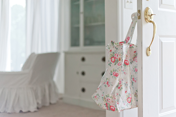
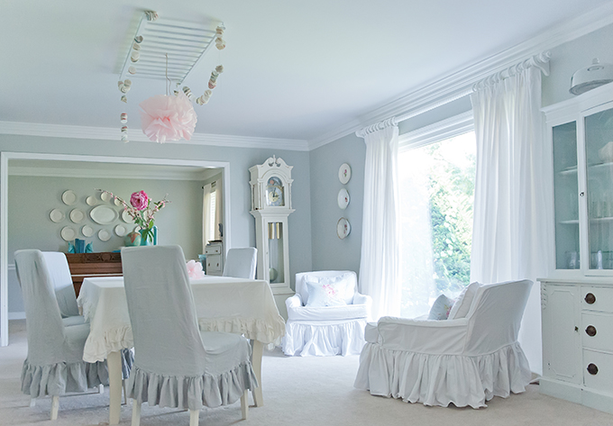
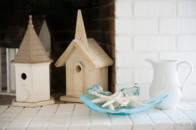
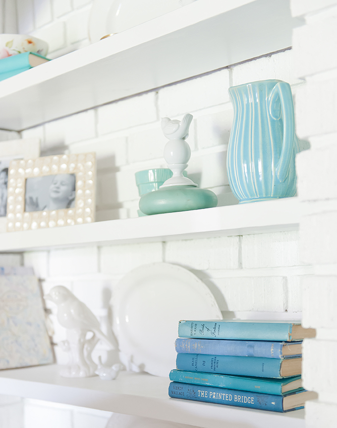
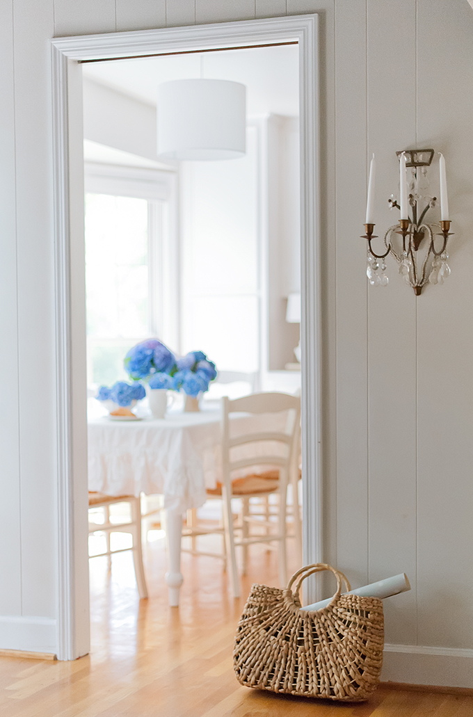
Hey guys! I’m Kristie Barnett of The Decorologist. Today I’m sharing a project that required a major color makeover. When my client bought this home last year, it was too dark for her sunny personality. There’s nothing like a whole lot of white to give a dated home an instant facelift. With a backdrop of white, even hints of color pop – like the turquoise and pink you will see throughout this space.
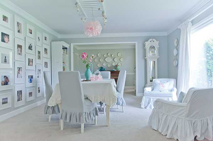
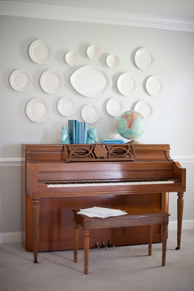
At my suggestion, she actually painted the 1980’s glossy wood grandfather clock white. The piano you see is next on the list for a paint makeover! I have another client who no longer needed it, so I hooked them up and Christiana got to take this baby home for FREE.
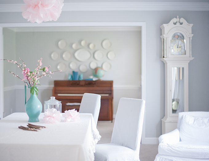
Maybe I can convince her to paint it turquoise!
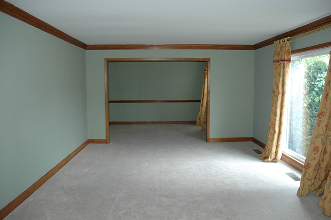
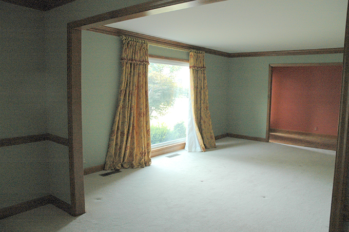
Again, the previous color palette was warm and fairly dark. It’s difficult to imagine all the white furnishings in a space like this, isn’t it?
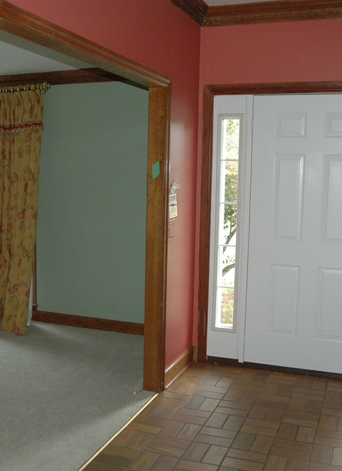
This is a “before” shot from the opposite side of the room. The oak trim dictated warmer colors, not the cooler palette my client was hoping for.
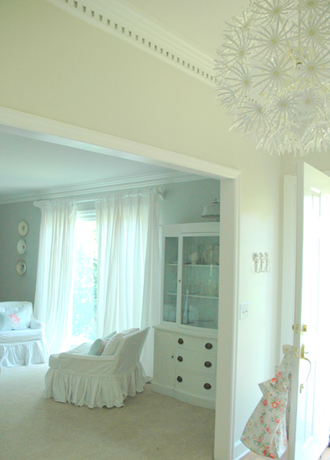
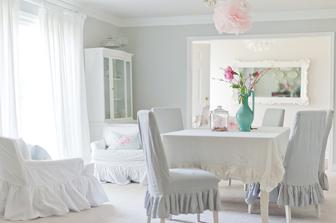
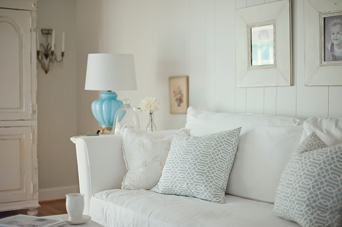
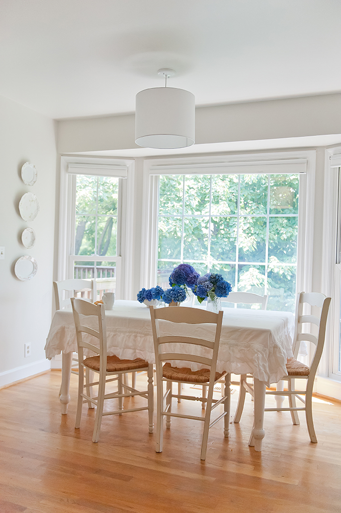
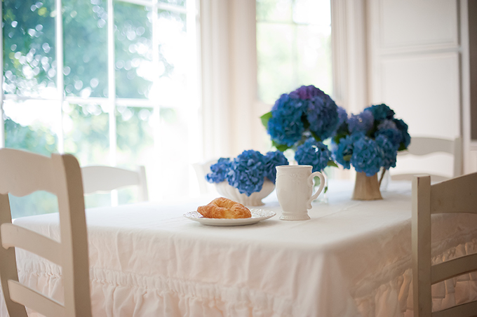
The bright, white trim makes a huge difference in the space. The oak trim pulled your eye and chopped up the room. With white trim and light gray walls, the entire room looks larger, more open, and quite heavenly! Christiana made all of the beautiful slipcovers in this house. Her specialty is ruffled tablecloths, which you can find in her Etsy Shop, Ruffled Linens.
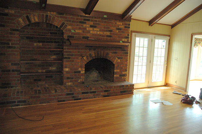
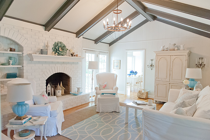
As we move into the family room, you can see how dark this space was previously. Although the paneling had already been painted, the brick wall dominates the space and the oak beams look dated.
I hope you enjoyed the befores-and-afters of this Nashville home! Thank you to Erin for letting me share here again on her beautiful blog. If you want to learn more about transforming your home by choosing beautiful paint colors, mixing high and low decor, and arranging furniture and accessories, please come visit me at The Decorologist!


This is beautiful! What a great transformation, Kristie! This is really inspiring!
As an interior designer,I am always changing this around my house and I will be painting my bedroom in Gray Owl in a few days. Seeing the color in some of the spaces here just made me grab the paint brush a little earlier!
Thank you for the inspiration!
Big hugs to you, Erin and Kristie,
Luciane at HomeBunch.com
White is wonderful. Mixed with own white or other colors. It was beautiful! Congratulations!
Moema-Brazil
Love all the ruffles!! No way my husband would go for it though. Very cute space!!
What paint do you have on the fireplace? Love the transformation!
Kristie, Kristie, Kristie. Oh my goodness. What a gorgeous heavenly floaty home. I am in love with it all. Who cares what husbands think.Ha! This is sheer delight! Can you come to Ohio????
I echo Carol Jane's comments. Wow! I am speechless. And I live in Ottawa, just in case you are in the neighbourhood.
The grey to me looks so drab and uninviting. The look she went for is "little girl room" and not chic in the least. But what really bothers me about this disaster is
Painting a Grandfather Clock! That is disgusting. Its offensive that a precious antique treasure would be ruined like that. Horrific indeed
Lindo, lindo, lindo, é tudo o que posso dizer. A parede repleta de quadros está divina!
Bom final de semana,
Denise – dojeitode.blogspot.com
Well, I am a fan of white, and these rooms are a showcase of white. I can imagine the house near a beach, and the clean, sea air wafting in through the windows, mixed with the scent of garden flowers. Lovely. As for the grandfather clock – I think it looks very pretty, but a turquoise piano would look marvellous and I would definitely be brave enough to do that!
THAT must have taken A LOT of paint!! franki
To the person who complained about painting a precious antique treasure….I had no idea clocks from 1980 were antiques lol.
LOVE IT! really beautiful
ERIKA
Tell me more about painting the grandfather clock..Did you have a painter do it, was in hand painted or sprayed? Do tell more about the clock.
Loved the makeover.
Thanks,
Linda
What a beautiful transformation! The thing that I love most is the painted grandfather clock. I would have never thought to do that and it looks fantastic!
Thank you for your comments! And for anyone who is worried about that grandfather clock – it is NOT an antique heirloom, but is from the 1980's and had a glossy orange finish (I'm sure you know exactly what I mean). Believe me, that clock is much happier with a few coats of white paint 🙂
I am very happy for the Clock! Sincerely! Susan
I'm not usually a fan of all white (or white-ish) but this is lovely and what makes it are all the vintage pieces sprinkled around. The linens are very pretty. And I definitely vote for a turquoise piano.
LOVE LOVE LOVE! I love white rooms! I would swoon too over that piano painted turquoise :-)Go for it! As the wife of a Registered Piano Technician, we've painted several pianos. (So much easiser/less expense than refinishing) There are definite "tricks" so you don't get paint into the playing mechanisms or how to paint so the parts can be easily taken apart for maintenance 😉 Do show us the piano when done.
A Beautiful room! Maybe the person who was horrified by the painted clock misread and thought it said 1890's instead of 1980's? And the ceilings really make the room!
While the room is not my personal taste, I can still enjoy the beauty of it! I bet your client smiles every time she walks into that room!
I also wanted to ask, does the beautiful white look carry throughout the rest of the home? If so, would love to see more pics 🙂
Amazing transformation. Just beautiful. If you have the guts to paint the piano turquoise it will be the show stopper of the room. Please do! Best, Beth C.
This has given me the courage I need to paint our original wood trim white. What a difference!
Color is truly transformaive! ..the house is really a completely different space!
I would only have done one teensy bitsy thing different and that would have been to paint the clock a pale aqua..I think it would have been so pretty. It does make sense in white…but agua…the bomb!
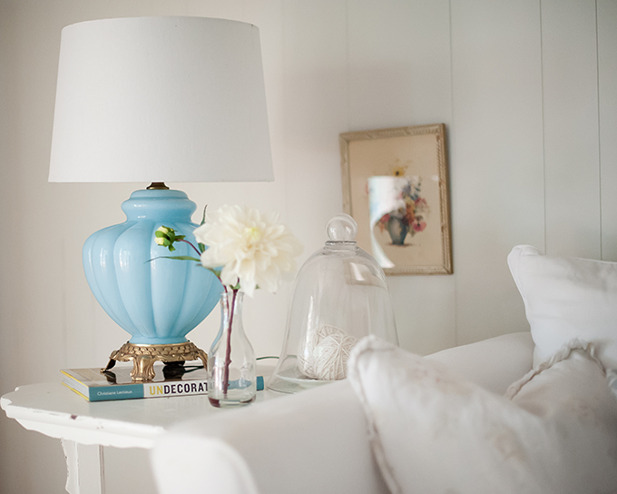
PS I will forever and ever hunt down the mate to that aqua lamp you found at a antique sale!!! to die for!
Kristie, Your rooms always make me smile. What a great way to start my Monday!
The rooms are gorgeous!!!
I sure wish I could buy the original curtains though….they would be perfect in my DR and LR :^) I can appreciate all of the hard work, and it is lovely, but red and yellow are just my colors :^)
Blessings to you,
J
I wish this was my home. You have completely captured my design taste. Where can I find that tablecloth or did you make it?
Though white isnt my home fav'rit colour, i love the tranformation
I like what you’ve done here. I have a big question for you. How do I keep Benjamin Moore Gray Owl from looking so powder baby blue at night? I have a painter painting it as we speak, and last night I just cried because it looked so light blue in the night lighting. Other than spending another $2,000 to have him repaint it another color…. what can I do lighting wise???? I love the color in natural light.