


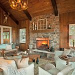
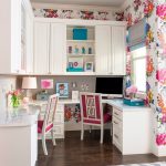
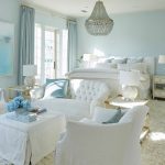
This Naples, Florida cottage designed by Renée Gaddis Interiors is coastal casual at its finest, and I wish it were mine! I cannot get enough of the layers of texture and beachy colors, not to mention great accessories everywhere. It all feels so cozy and comfy! The bedroom with the four-poster bed is is especially dreamy! And how about the laid-back guest house in the last two pics? I’d be more than happy just to live there! There’s more photos by Doug Thompson to see, so finish your tour of the home here!
Love turquoise? Visit my shopping blog Everything Turquoise…updated several times throughout the day! Check out Decor by Color for even more color-themed shopping!

LOVE all of this!!
Renee Gaddis is a wonderful designer..LOVE her eclectic style…gorgeous!
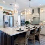
There is so much that is good about these rooms, the colors, the furniture and the textures, but I can never understand why these rich people use such ugly accessories. It reflects very poor taste. That horrible statue in the kitchen counter? One has to ask why? It has no place in that house and the other accessories reflect very poor taste. Its a nightmare of poor taste and bad decorating. To bad because it had potential and is crying out for good decorating.
Absolutely beautiful!!
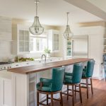
I just LOVE the barstools at the kitchen island — any idea where to find/purchase?
Erin, I don't know how you do it, but you have me something amazing to look at every single time. This is awesome! I love the "ugly" statue on the kitchen counter.
Any idea where the kitchen counter stools are from???
this is a jaw dropper of a house and i love the accessories. They give the house it's personality and tell about the life of it's occupants. It takes a lot of confidence to put that statue in the kitchen!! Bravo to the designer and the home owner!!!
I normally swoooon over these posts but today is a little different. There are some lovely features but for the most part my eyes glazed over. I think this space reflects a desire to do too much in too little space. Too busy with elements working against one another.
I really love this place because it seems quite cosy and "homely" as opposed to some of the homes you show that are quite grand in fittings and sheer size of the home. Love the paint in the 2 bedrooms – wonder what that is?!
Love the powder bath!!! The mirror and colors are so classically pretty!
I'll take the guest cottage.
I LOVE your posts:) and I always leave your blog with a big smile.
Check out my new summer post and have a great day dear:)
LOVE Maria from inredningsvis.se
(sweden)
Very cool textures throughout. My fave, though, is the guest house. I love pretty, happy color. Isn't that abacus a terrific accessory?
I want to add that I really like the way the art was hung on the worn shutters and the lighting on the woood planks on the wall. They add such nice definition and presence.