Hi there!
Allow me to introduce myself, your guest blogger today. My name is Celia Becker and I am the voice behind the lifestyle blog After Orange County | The OC Housewife Who Ran for the Hills. After Orange County is a publication dedicated to living life in the slow lane. I escaped The OC for life at a higher elevation. Leaving suburbia behind, I now live in the beautiful mountain resort of Lake Arrowhead, California. My readers join me at 5,000 feet above and beyond as I cook, garden, renovate, entertain, travel and live life After Orange County.
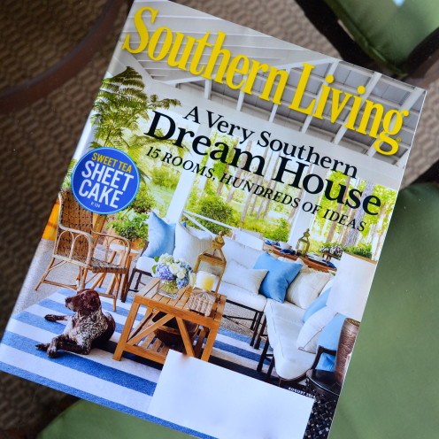
Having just returned from a Southern road trip, blogger extraordinaire, Erin, invited me over to share with you my visit to a very southern and very turquoise, dream home, The Southern Living Magazine 2014 Idea House.
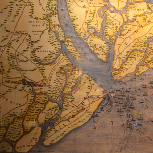
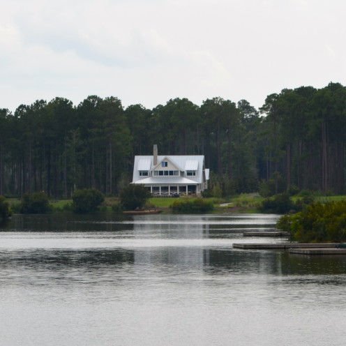
The Idea House recently opened in the magnificent resort of Palmetto Bluff, located in Bluffton, South Carolina. Palmetto Bluff is located in the heart of the South Carolina Lowcountry.
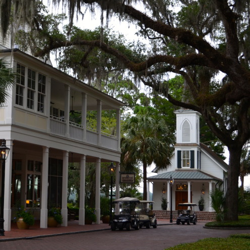
It’s an idyllic, planned community where ancient, moss-draped oaks decorate the charming village…
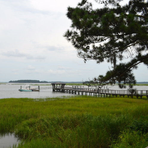
and a lazy, winding river, salty marshes and a bevy of small lakes…
provide the backdrop for refined cottages and homes that have the style and grace of a bygone era.
This is where Southern Living Magazine, in tandem with a long list of sponsors…
architect Ken Pursley, and Interior Designer Suzanne Kasler, placed this year’s Idea House.
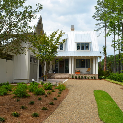
Approaching the house from the street and driveway the home looks surprisingly modest. I read in Southern Living Magazine that the architect planned it that way. He felt this home and its lake-front location, was the perfect candidate for multiple personalities. In fact he was quoted as saying that every Southern home needs “A humble face, a gracious heart, and a bottle of bourbon.” This house certainly meets all of that criteria, starting with the “humble face” here.
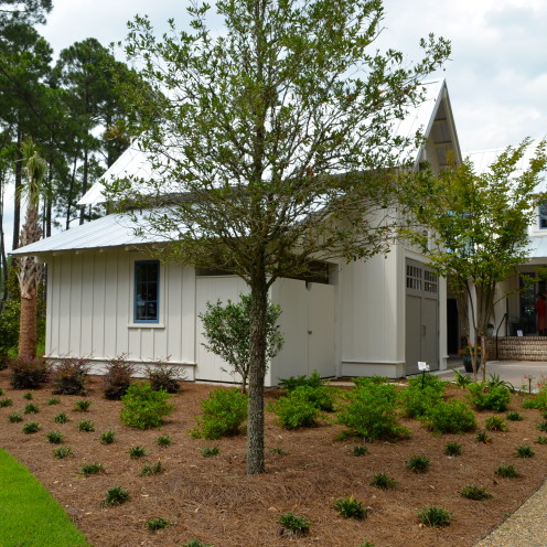
What appears below to be a garage is actually intended for a golf cart (although it fits 1 car), a very popular mode of transportation around Palmetto Bluff.
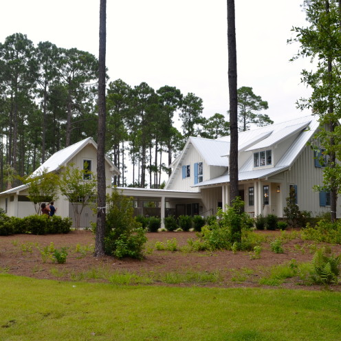
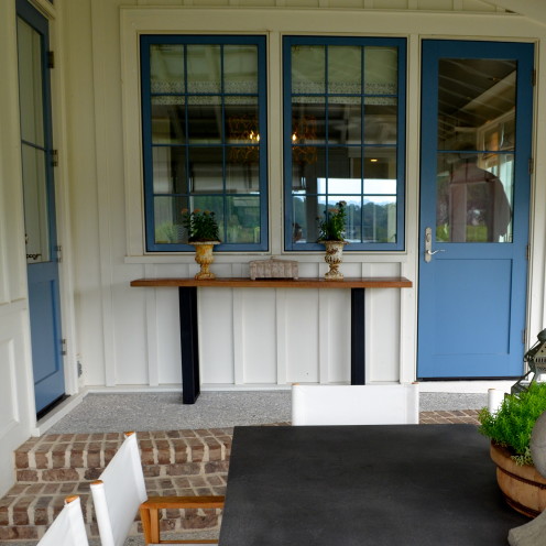
Looking at the home from the side, one gains a more impressive perspective. The covered portico between the garage and the home is intended to be used as a carport, but doubles as entertaining space as well. Before even stepping inside the house, the use of what we all came here to see, “Turquoise” is already evident. The blue shutters provide the perfect accent to the all-white home, and connects the outside of the home to what you are about to see in the interior. The white paint is called “Shoji White” by Sherwin-Williams. The blue accent paint used on the doors is “Leisure Blue” by Sherwin Williams. The custom windows, made by Jeld-Wen, are in a color called “Cascade”.
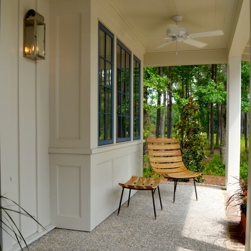
No Southern home would be complete without a covered porch and comfortable chair, and in this case, a ceiling fan.
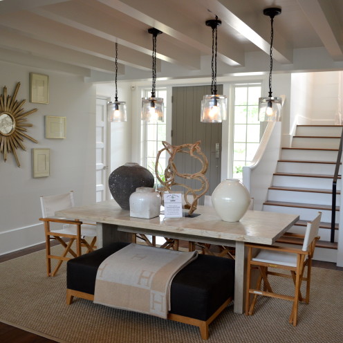
Stepping inside the modest front door, one walks directly into the dining room. What I loved most about Suzanne Kasler’s dining room decor was the fabulous Hermes blanket laid strategically on the large ottoman/bench.
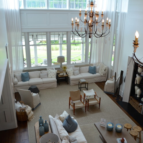
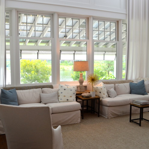
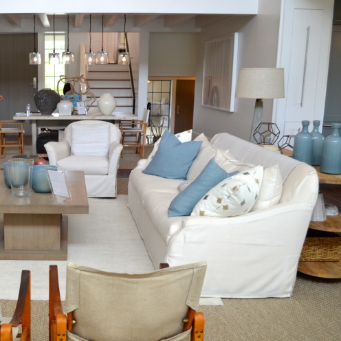
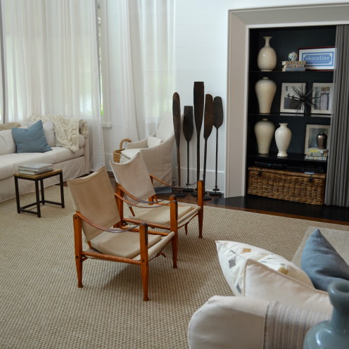
The dining room plays 2nd fiddle to what awaits just beyond: the grand 30 x 16 1/2 foot living room. This is the “gracious heart” of the home that the architect referred to. The floor-to-ceiling windows, draped in lightweight sheers, provide stunning views to the lake just beyond and flood the room with light.
As you can see, the white and blue color scheme we saw outside has now been brought indoors. The walls are bathed in Sherwin-Williams “Pure White” throughout, and the upholstery includes shades of white and natural with blue accents. In Southern Living Magazine Designer Suzanne Kasler described the blue as a “Sophisticated French Blue with gray and green undertones.”
And when designer Suzanne Kasler was asked by Southern Living Magazine, “What are your go-to colors?” Her response: White and Blue.
I love the vintage Danish Safari Chairs used in the room, and I’m definitely going to steal the idea of using oars as sculptural accent pieces. The huge sisal area rug adds warmth while keeping it casual.
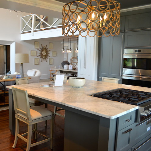
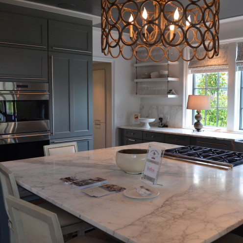
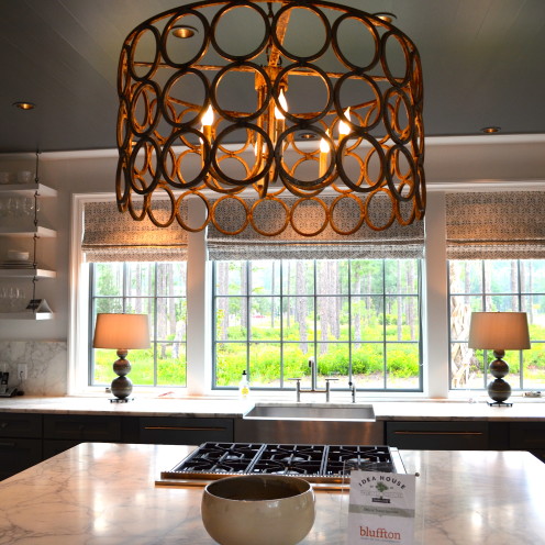
One of the features I liked most about the Idea House floor plan was how the kitchen is open to the living room and flanks the dining area. The large island seats four and is crowned by a contemporary metal chandelier that was perfect for the space. I also love that the cooktop is in the island. This way, when entertaining, the hostess/host can cook and be a part of the action at the same time.
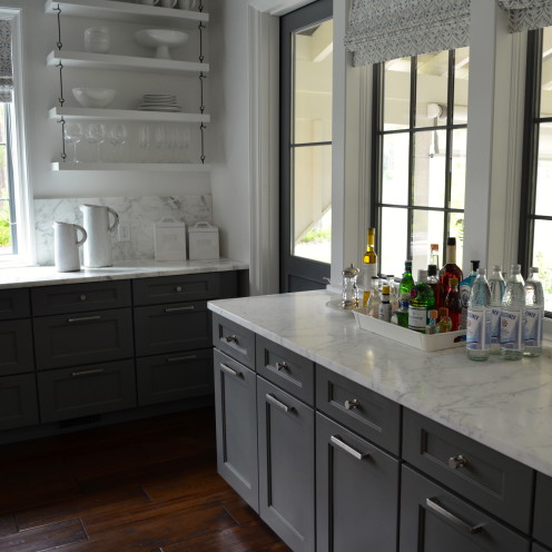
The left wall of the kitchen, the only windowless wall, houses the rest of the appliances in floor to ceiling Shaker style cabinets. They are a gray-blue shade called Willow, from www.wellborn.com.
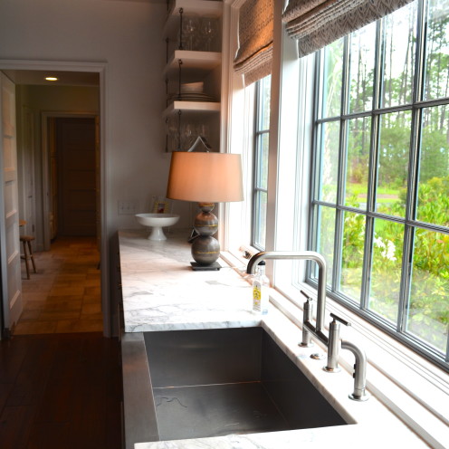
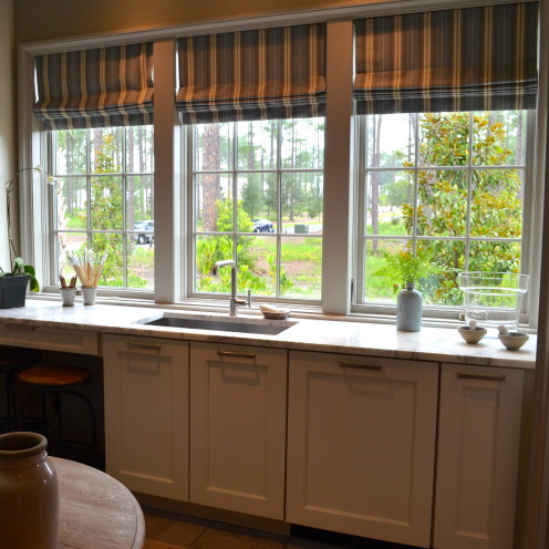
Another wall of windows at the sink will make dishwashing less painful. And, notice how the ceiling is painted? The Winchester Gray color, again by Sherwin-Williams, contrasts nicely with the white walls and Calacatta marble countertops.
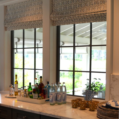
The right wall of the kitchen is again a bank of windows with a door that leads out to the porch. The countertop does double-duty as a bar, which undoubtedly features architect Ken Pursley’s obligatory bottle of bourbon.
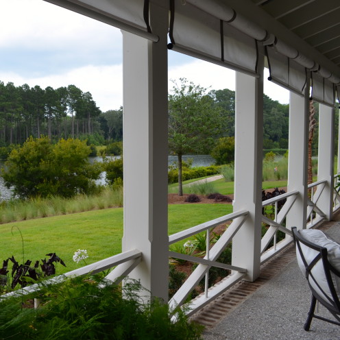
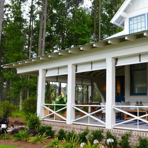
Just on the other side of these kitchen windows lies the 49 foot long, 12 foot deep, wraparound back porch.
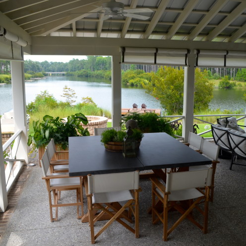
Exiting through the kitchen door there is a 2 foot step down that places you in a dining pavillion.
The architect intentionally lowered the back porch so that the outdoor furniture would not impede the view of the lake from inside the home. Brilliant!
Convenient to the kitchen, the outdoor dining area consists of two tables that were combined to make one large square table.
Unlike most porches in Southern homes, this overhanging porch is not screened in. Instead the designer used rollup window shades that can be lowered as needed.
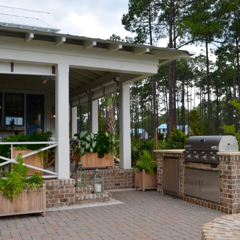
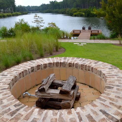
Steps from the dining area is a grill and firepit.
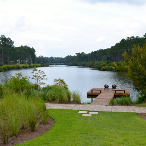
A viewing platform with Adirondack chairs overhangs the water and makes a great place from which to throw in a fishing line.
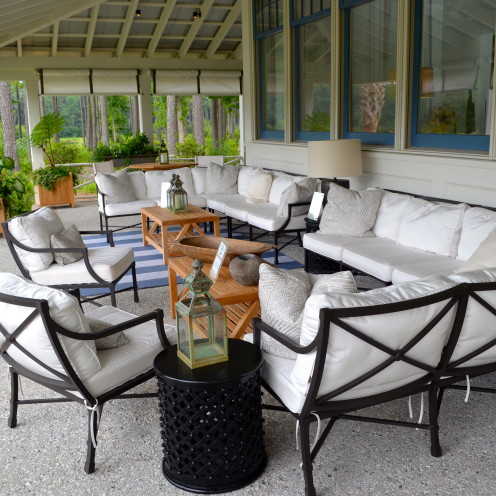
On the other side of the wrap-around porch is a comfortable outdoor seating area and outdoor living room. It carries out the same white and blue color pallette as the interior.
Here two sectionals were placed side-by-side to create a U-shaped seating area, accented by a large blue and white striped rug. Notice again how the porch sets down off the living room and does not block the view.
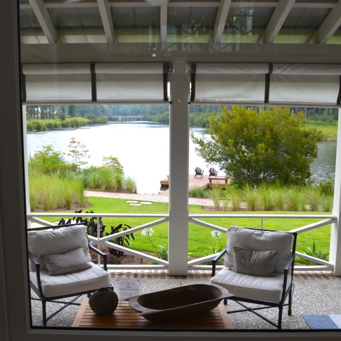
Proving that point, this photo was actually taken from the living room window looking out to the porch and lake beyond.
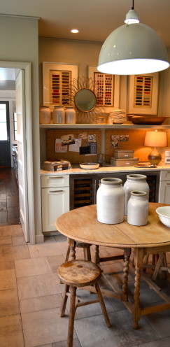
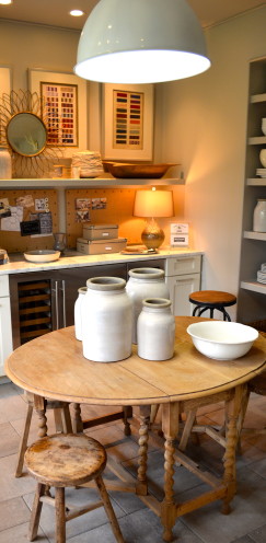
Now, lets return to the interior of the home where there is lots more to see. Entering through the kitchen, a door on the opposite wall opens into what is called “The Clutter Room”.
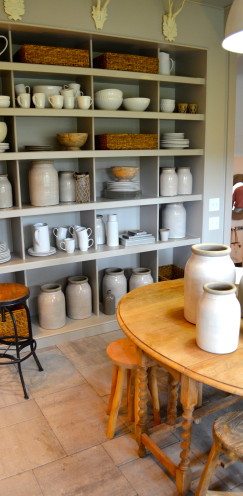
It is designed to function as a multi-purpose room that combines a butler’s pantry with a craft room. The antique gateleg table is perfect for crafts, informal meals or can be used as a desk.
There is a wine chiller on one wall…
a full wall of shelving for kitchen overflow on another wall…
and a third wall that houses a sink and additional dishwasher.
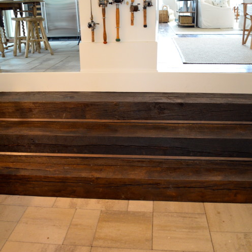
And, as if that weren’t enough, both the dining room and the clutter room open into the mudroom by way of stairs made from antique timbers.
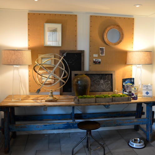
The mudroom is furnished with an aged farm table that is backed by two bulletin and chalkboards, perfect for messages and organization.
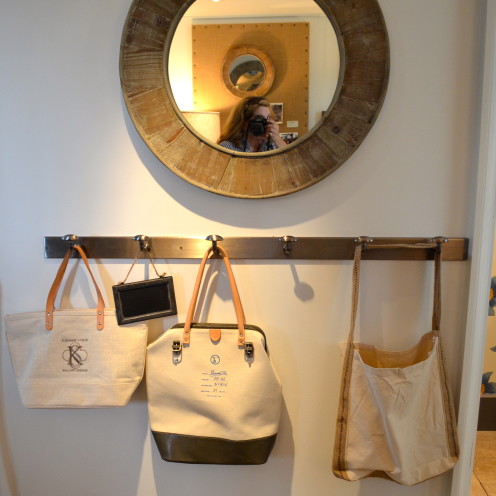
A row of iron hooks is convenient for holding purses and keys.
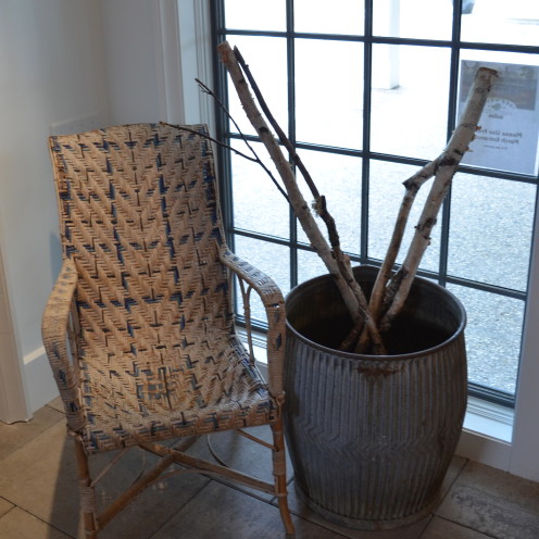
There’s a chair for taking on and off shoes and a basket of walking sticks.
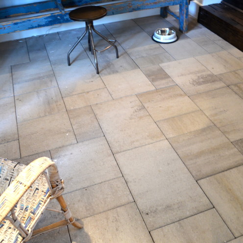
The flooring in both the mudroom and the clutter room is outdoor pavers, a durable material that will hold up in a busy space. They are Lafitt Grana Slab Pavers made by Belgard in an antique limestone finish.
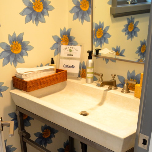
Just off the mudroom is a small powder room, papered in a whimsical flower pattern called Floria. It’s from AbnormalsAnonymous.com.
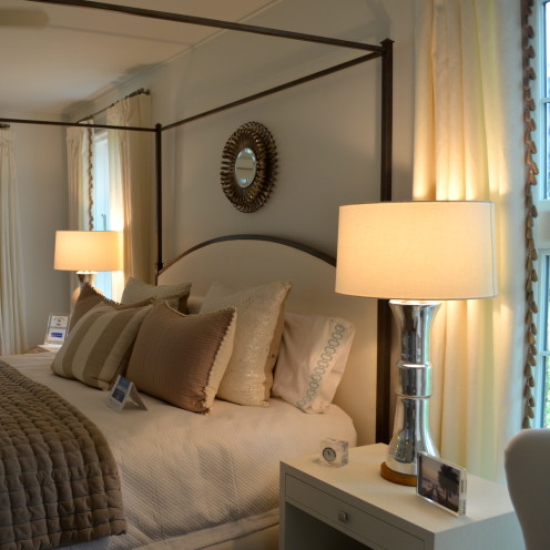
Also located on the first floor of the Idea Home is the master suite. Positioned at the back of the home, it too has a water view and a door that connects it to the back porch.
The wall adjacent to the bed displays some modern, turquoise artwork and pottery.
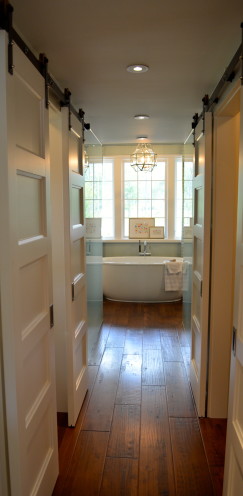
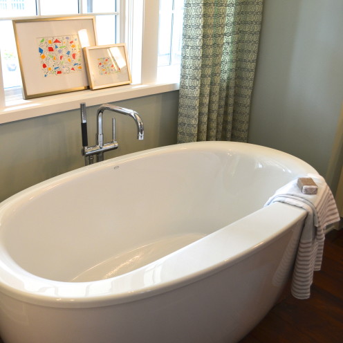
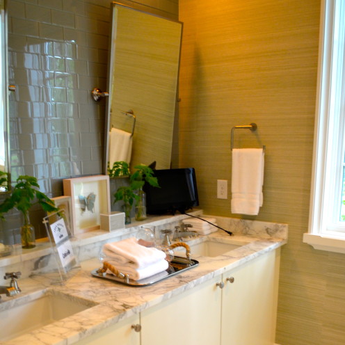
A long hallway flanked by his and hers walk-in closets leads to the spa-like master bath with its freestanding tub.
The walls are painted a soft blue called Rainwashed by Sherwin Williams.
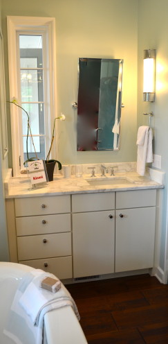
The tub is flanked by separate his and hers vanities.
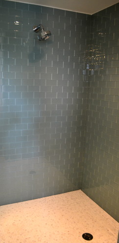
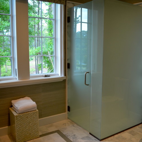
Opposite the tub are two frosted-glass compartments. One is a generously sized shower stall, tiled in blue glass subway tile.
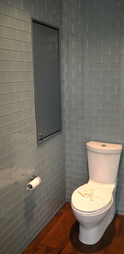
The adjacent stall is a water closet.
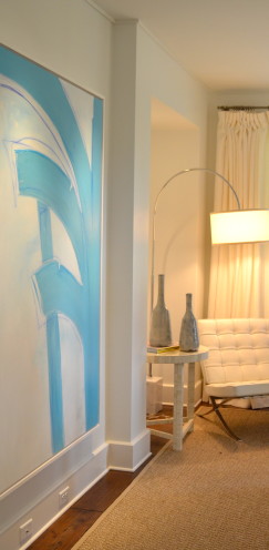
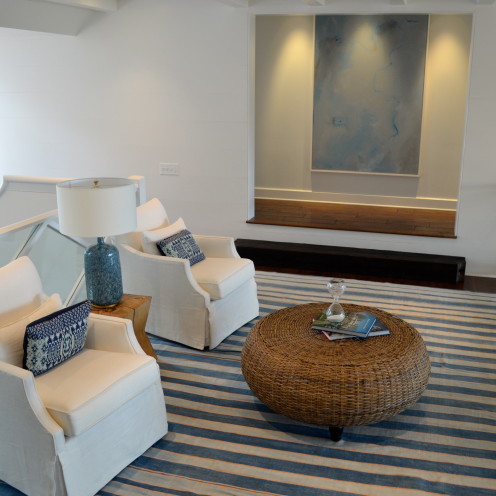
Now let’s head upstairs where we arrive at what the architect calls “The Bridge”. That’s because it is an open, loft-like room that connects the two upstairs wings of the house. Staying true to the blue and white palette, this room has a blue abstract painting on the wall and an indigo striped dhurrie rug covers the floor.
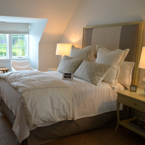
A neutral palette was used in the comfortable upstairs guestroom where a pair of upholstered chairs are tucked into the dormer window that overlooks the lagoon below.
The luxurious guest bath mimics the master bath with the use of the blue glass subway wall tiles by Daltile. The walls are papered in Phillip Jeffries Bermuda Hemp in Harbor Blue.
Also mimicking the master bath is another glassed-in water closet.
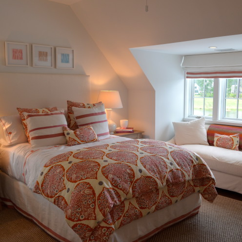
Taking a departure from the blue and white palette used in the rest of the home, citrus orange, pink and rhubarb were used in the girls’ bedroom.
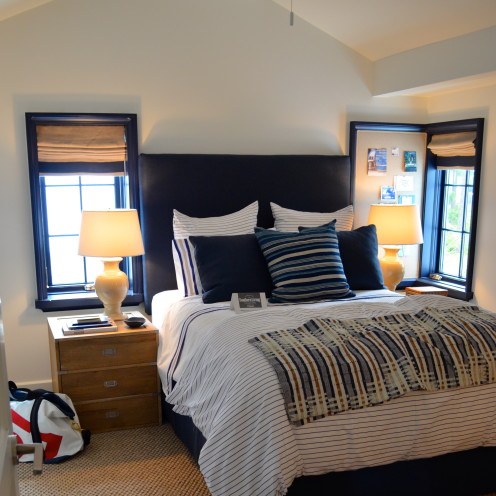
Next door in the boys’ room the designer used navy blue and white, paying homage to the water orientation of the home.
That concludes my tour of the 2014 Southern Living Idea House. I hope it gave you lots of great ideas.
I am very grateful to Erin for inviting me into her House of Turquoise and I hope you’ll come join me at my home on Lake Arrowhead soon. You can visit me at www.AfterOrangeCounty.com
Thanks for dropping in!





Lucky you to visit the pretty house, but it is
a little bland in the interior. And I absolutely hate the couches pushed against the windows in the living room! Lovely setting on the lake!
From Margie in Toronto – have to say that I agree with kimmylouwho – for such a beautiful space I find the furniture layout rather odd – both indoors and out and such a gorgeous setting would certainly support a bit more punch of colour throughout. It's lovely, but I think they missed their chance to make it amazing!
From Heather in SoCal- I absolutely loved the hypnotically serene blue and white decor! It completely sets the stage for calm and peaceful living in an overly hectic world. I would be in Nirvana if I woke up every day in a home like that. These photos are giving me the courage to consider painting my woodwork white to finally bring in the light!
I love the ceiling color in the kitchen! That detail might be my favorite thing inside the house. But yeah, while I really like the serenity of the color scheme, it (overall) feels like something is missing.